RighView: Network Monitor Tool and Dashboard
Transforming support ticket resolution from a 15-minute data hunt into a 3-second glance via a role-based visualization system.
Democratizing network diagnostics for frontline agents.
Problem
COGNITIVE OVERLOAD
Support agents were navigating a bunch of cards and raw logs, requiring 10+ browser tabs and manual triangulation to diagnose a single IP address.

My Role
LEAD PRODUCT DESIGNER
Owned the end-to-end process from stakeholder strategy to high-fidelity visual systems. Collaborated with 2 PMs and 5 Engineers.
Solution
I designed a ROLE-BASED VISUALIZATION solution
A tiered dashboard system that translates complex network logs into instant "Health States" (Sentiment UI), enabling non-technical diagnosis.

Impact
25% FASTER RESOLUTION
Reduced Tier-1 escalations by 15% and increased setup success rate to 92%. Key factor in the acquisition by Plume Design.
Diagnosis was a process of manual data triangulation.
I can't find ... in ... [what I used to find it]...
Support Agent User Interview
Visualizing the invisible friction.
I audited the entire support ecosystem. By mapping the Tier 1 triage workflow, I uncovered that the "slowness" wasn't a network issue—it was an information architecture issue. So I moved beyond standard user interviews to conduct a system-level audit. By mapping the physical actions of Tier 1 agents, I visualized the hidden cost of "context switching."
The diagnosis was clear: The "slowness" wasn't technical latency—it was cognitive latency. Agents were forced to act as "human middleware," manually bridging the gaps between disconnected tools.

Role-Based Intelligence.
Instead of a one-size-fits-all dashboard, I architected a Tiered Disclosure System (Progressive Disclosure).
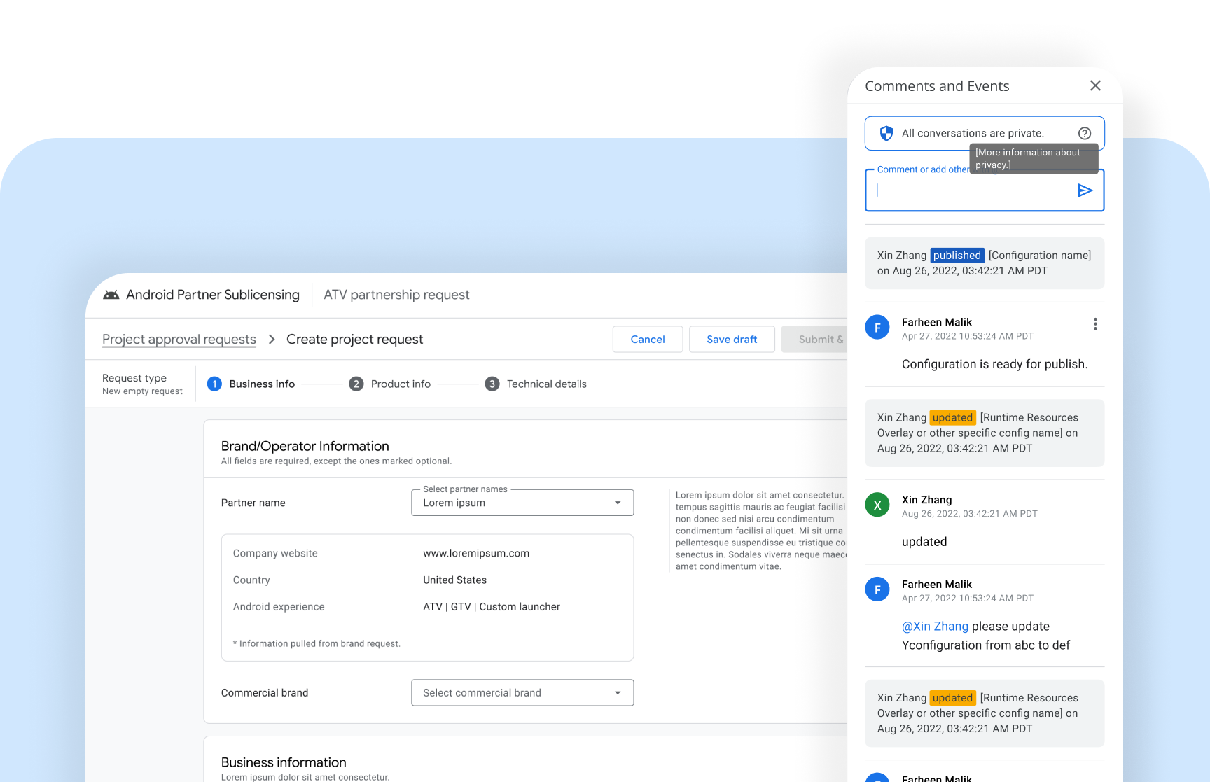
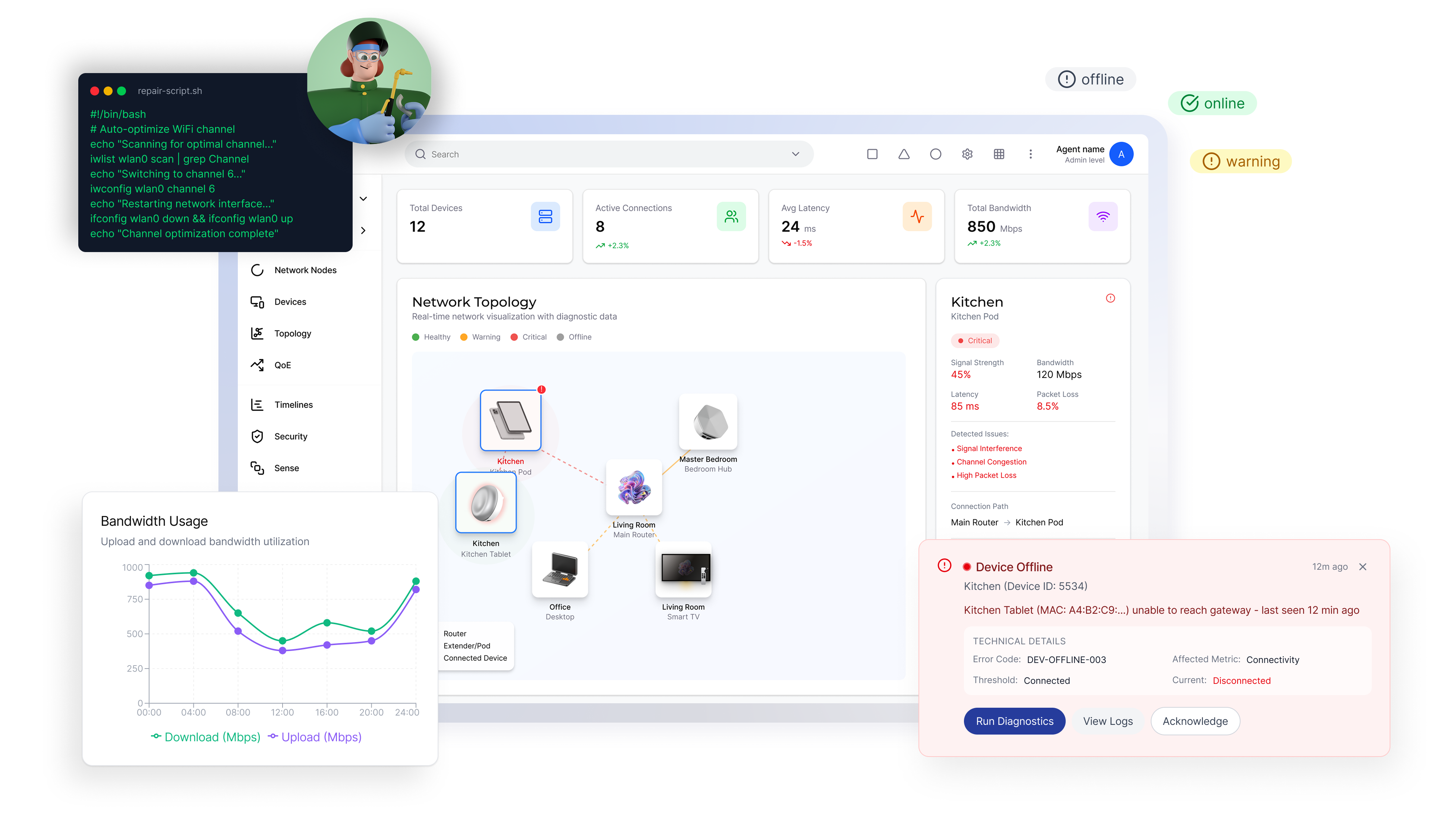
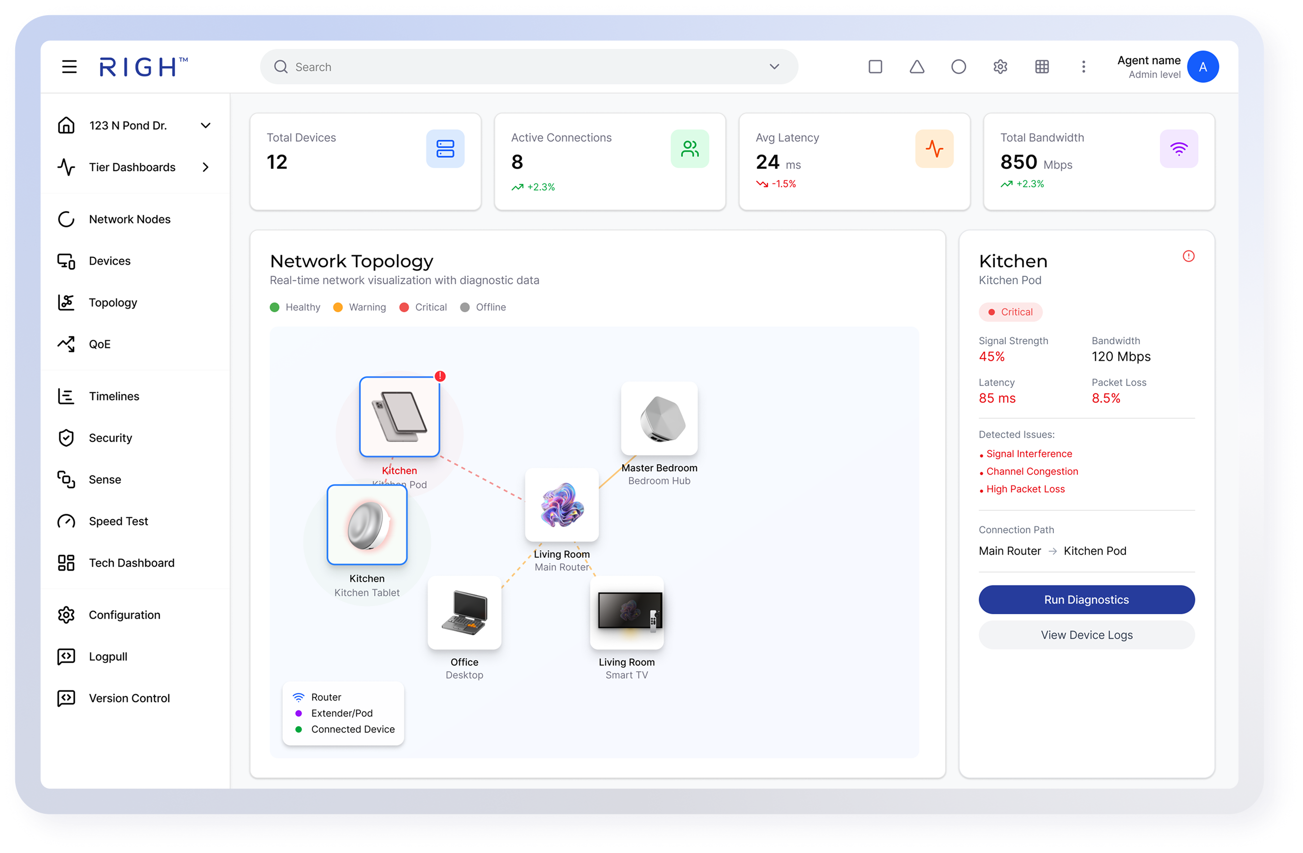
Tier 1 Dashboard Deep Dive
I replaced the original "Wall of Numbers" with a simplified topology map — a Shared VIsualization with end users.
Guardrails, Not Walls.
Simplifying the interface didn't mean removing access. While the Tier 1 view guides the "Happy Path," the lateral navigation provides Unrestricted Drill-Down.
Measurable Business Impact.
This design framework became a core asset in Righ's ecosystem, contributing to the platform's overall value and eventual acquisition by Plume Design.
25% Faster Resolution
Centralizing dispersed logs into a unified visual dashboard significantly reduced the Time-to-Resolution (TTR) for support agents.
15% Reduction in Escalations
The "Sentiment UI" empowered Tier 1 agents to confidently diagnose issues independently, reducing the burden on expensive engineering resources.
My Key Learnings
Curation over Reduction
I learned that simplifying enterprise tools is not about removing data, but organizing it. By using a Tiered Disclosure strategy, I balanced the high data density required by engineers with the clarity needed for frontline agents.
Visual Metaphors Bridge Gaps
I validated that translating technical metrics (latency numbers) into human metaphors is the an effective way to align cross-functional teams. This "common language" allowed non-technical users to operate with the confidence of network experts.
From Tool to Teammate.
The RighView Dashboard was the foundation (High Control). The next phase, RighGravity, introduces Agentic AI to the workflow.