Google Play: Enterprise Dashboard Redesign
Optimizing B2B workflows and data visualization for account managers.
Problem
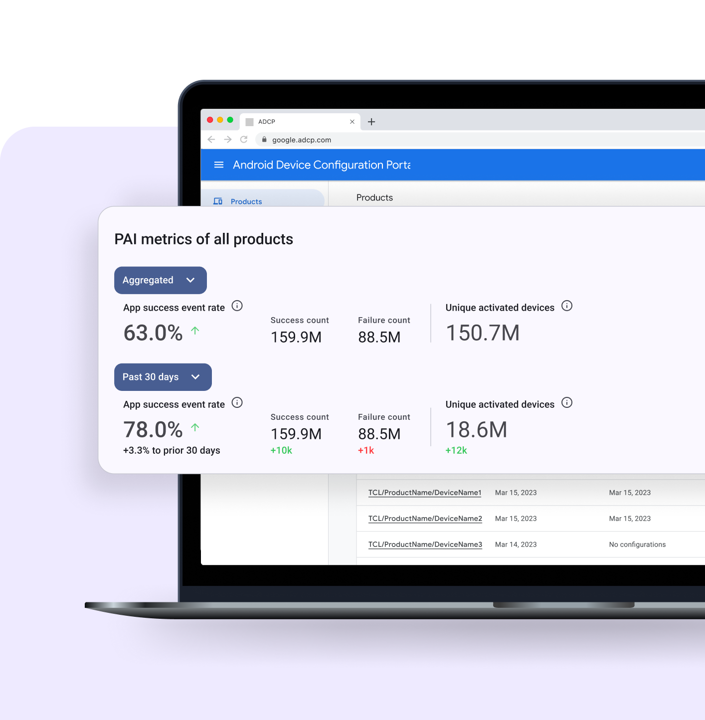
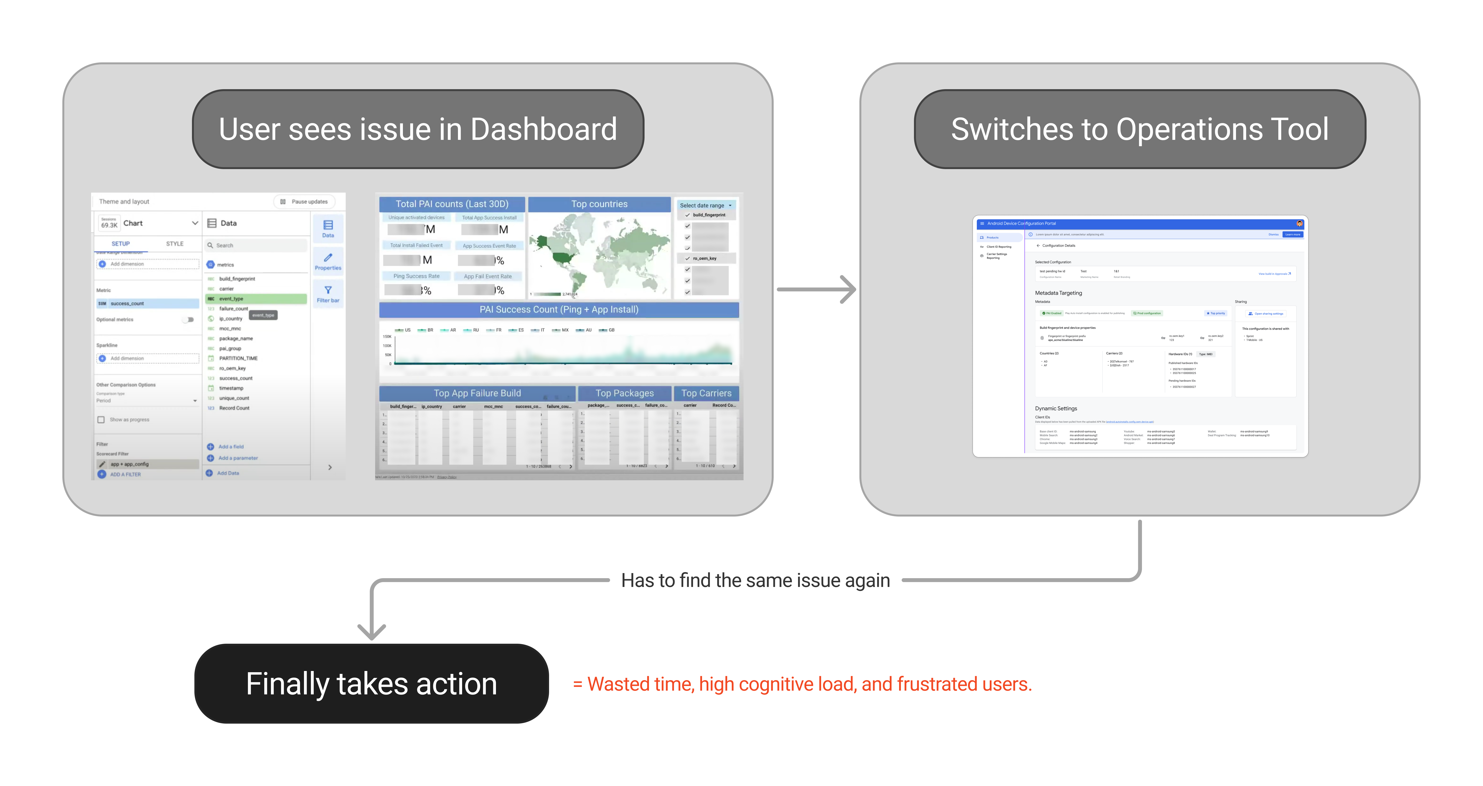
Android Devices Account Managers were drowning in a "data cloud." They had to constantly switch contexts between a data rich but not insightful dashboard to find insights and a separate operations tool to take action.

My Role
UX Designer (Contract). As the sole designer on this project, I was responsible for the end-to-end UX/UI, working under the guidance of a Senior Interaction Designer.
Solution
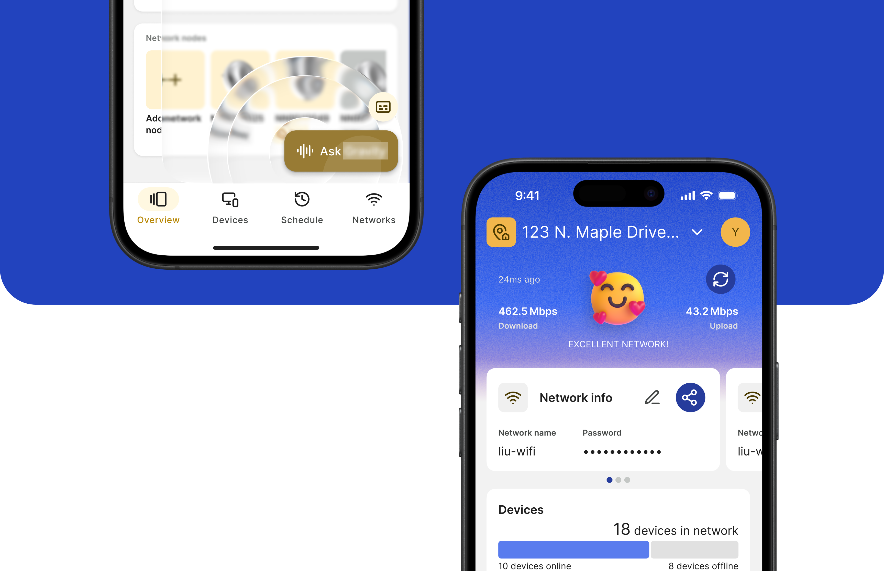
I first distilled the "data cloud" into a scannable "Scorecard." Then, I designed the integration of this new Scorecard directly into users' primary operations tool, placing critical insights right at the point of action.

Impact
My integrated design eliminated context-switching and empowered users to go from insight-to-action in a single workflow. It was adopted by the Account Management team as their new standard.
A Broken Workflow and "Data Dump"
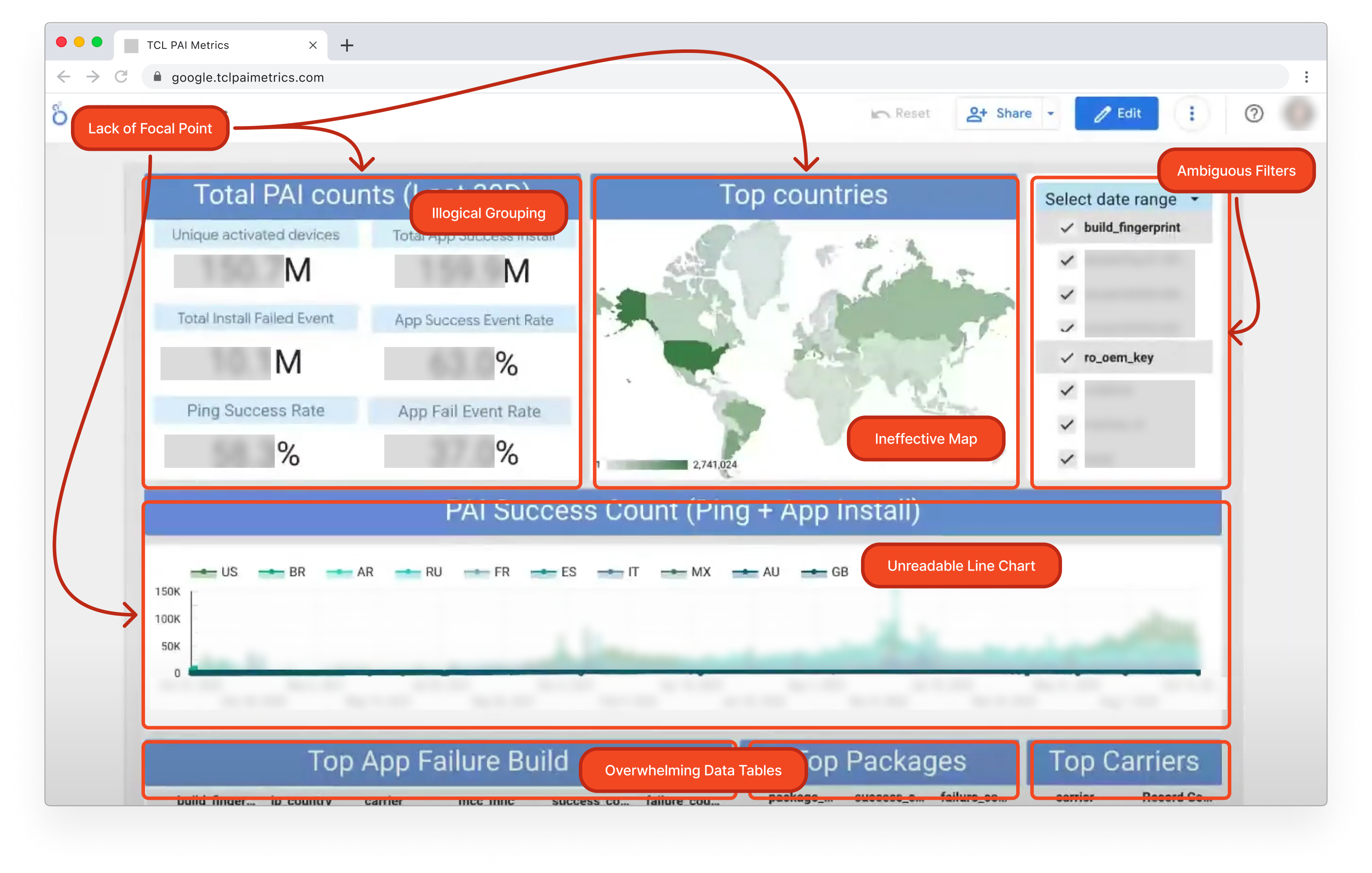
I have 30 seconds between client meetings to know if an app is on fire or not. I don't need to see 50 metrics, I need to know: 'Are we okay?'
Account Manager
Users Needed a "Pulse," Not a "Database"
I collaborated closely with our team's UX Researcher to understand why the costly Looker dashboard was failing. The UXR's 1:1 interviews with Account Managers (AMs) provided a critical 'Aha!' moment.
The research showed a complete mismatch of intent. The tool was built for deep-dive data analysis, but the AMs needed a 30-second 'Daily Health Check.' They weren't using it as a database; they were desperate for a simple 'pulse.'
My key contribution was to translate this raw research into a clear design principle: 'Surface the Signal, De-emphasize the Noise.' This became my north star for the 'Scorecard' concept and aligned my senior stakeholder (Matt) on the path forward.
From Insight to Principles: Setting the North Star
After synthesizing the UXR findings, I translated my 'Pulse vs. Database' insight into two core design principles. These principles became the compass for my entire design process, ensuring I solved both the data problem ('Signal vs. Noise') and the core workflow problem ('Close to Action').
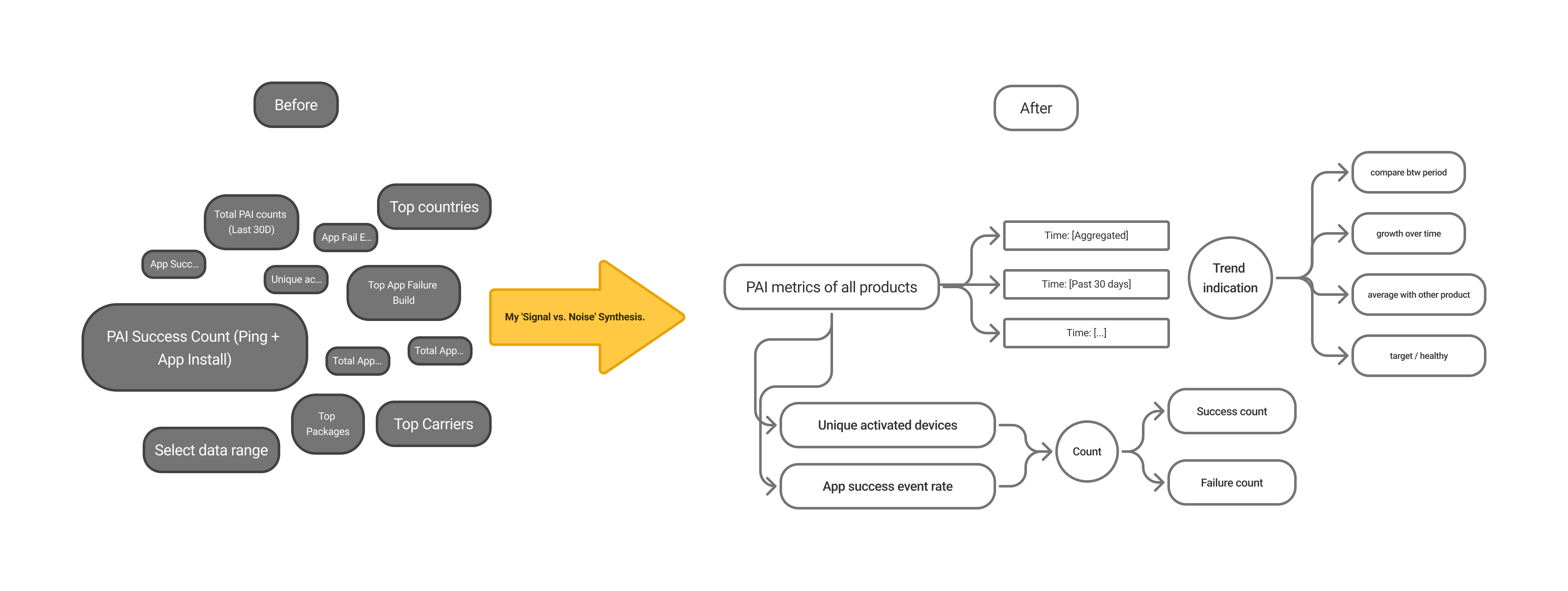
Surface the Signal, De-emphasize the Noise
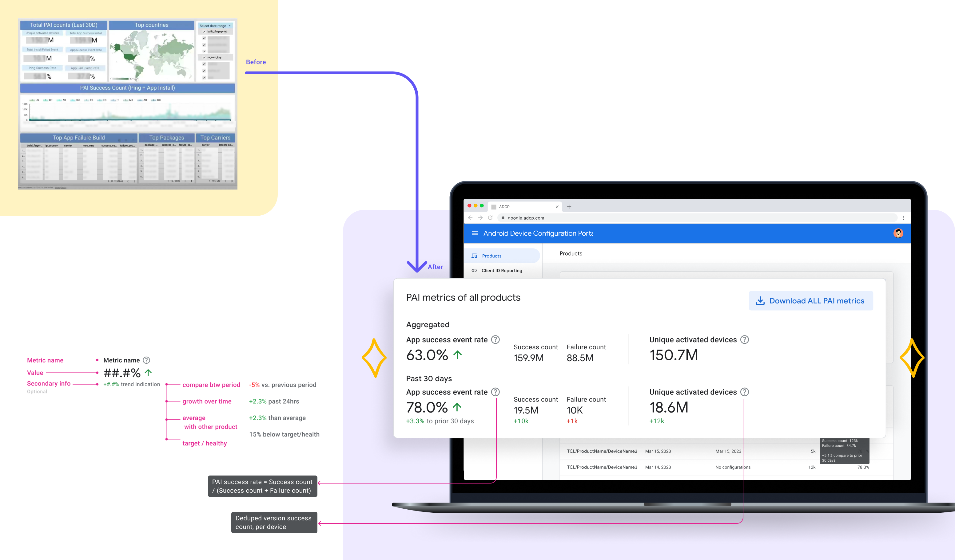
My first job was to fix the UI by distilling the 'data dump' into a scannable Scorecard.
Place Data Close to Action
My second, more critical job was to fix the workflow. The data, however clean, was useless if it wasn't integrated with the tools AMs used to act on it."
A Phased Approach to Fix the Workflow
Part 1: Distilling the "Data Cloud"
Part 2: Answering "Are We Okay?" with At-a-Glance Context
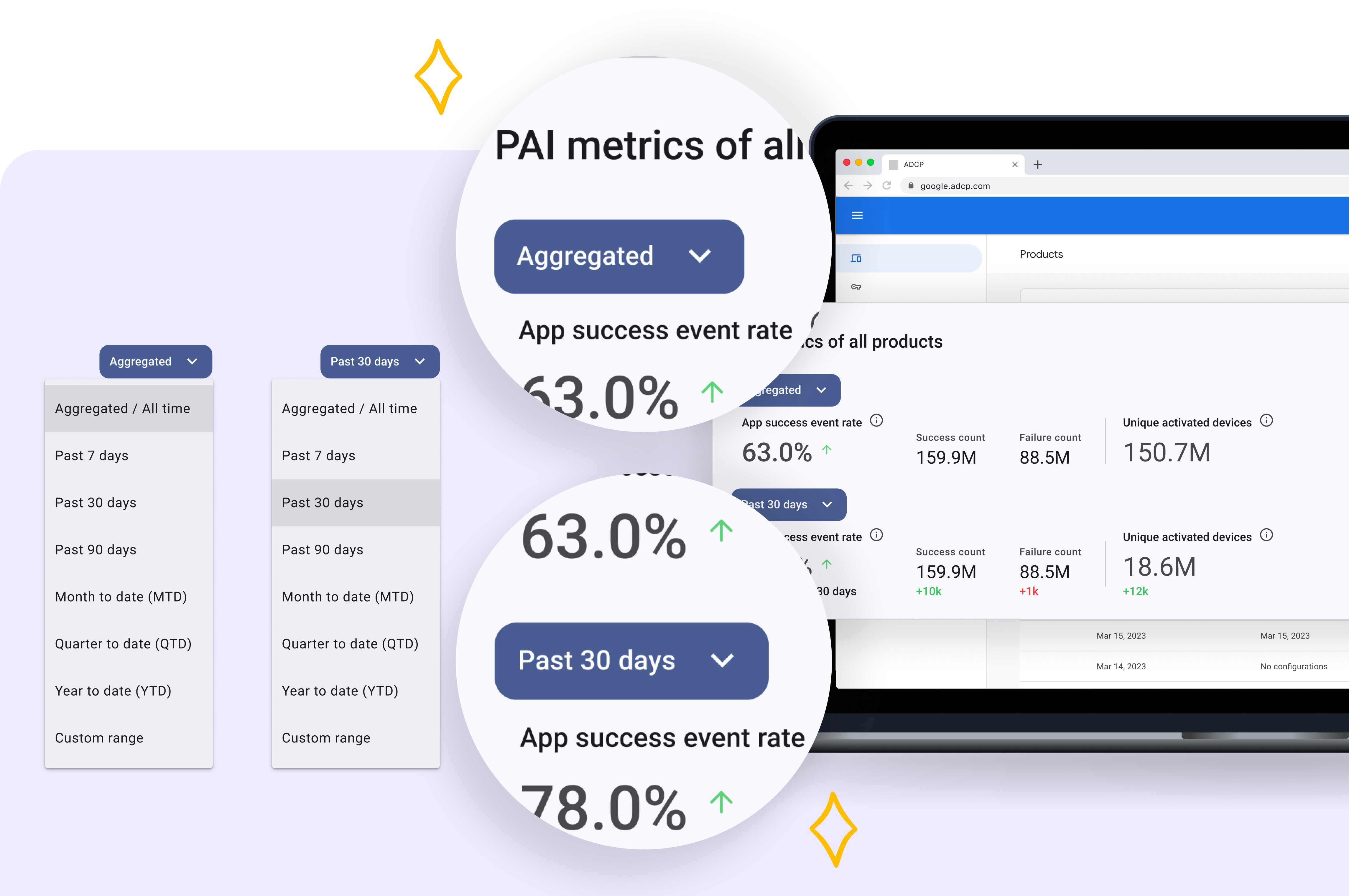
Part 3: Adding Data to Each Individual Navigation Level
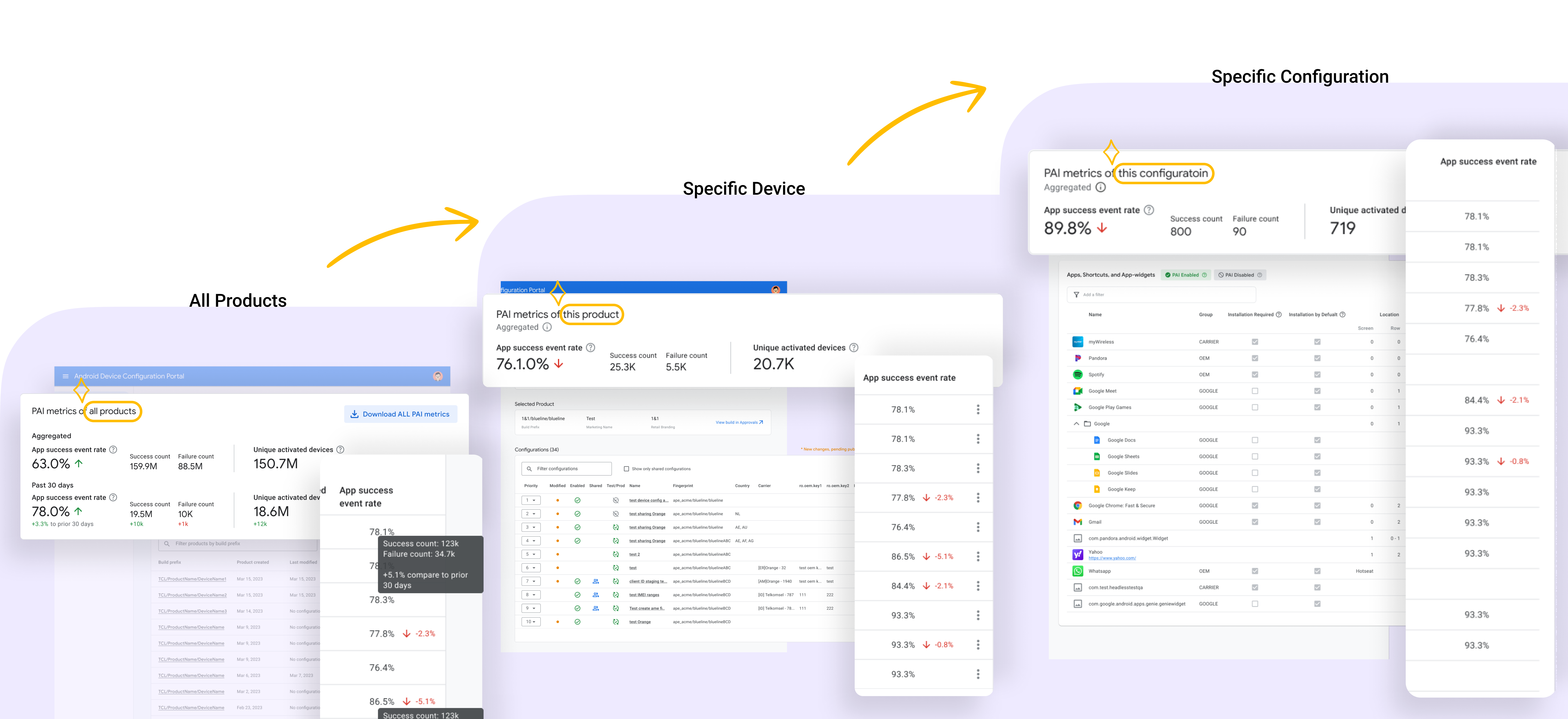
An Adopted MVP and a Clear Vision for V2
My MVP design was a huge success. By embedding the Scorecard, my design eliminated the AMs' biggest complaint ('data dump') and was adopted as their new standard workflow.
V1 MVP Impact (The Win Now)
MVP Adopted: My 'co-located' Scorecard design was adopted by the Account Management team as their new standard, finally unlocking the ROI of the Looker data.
V2 Vision (The Future)
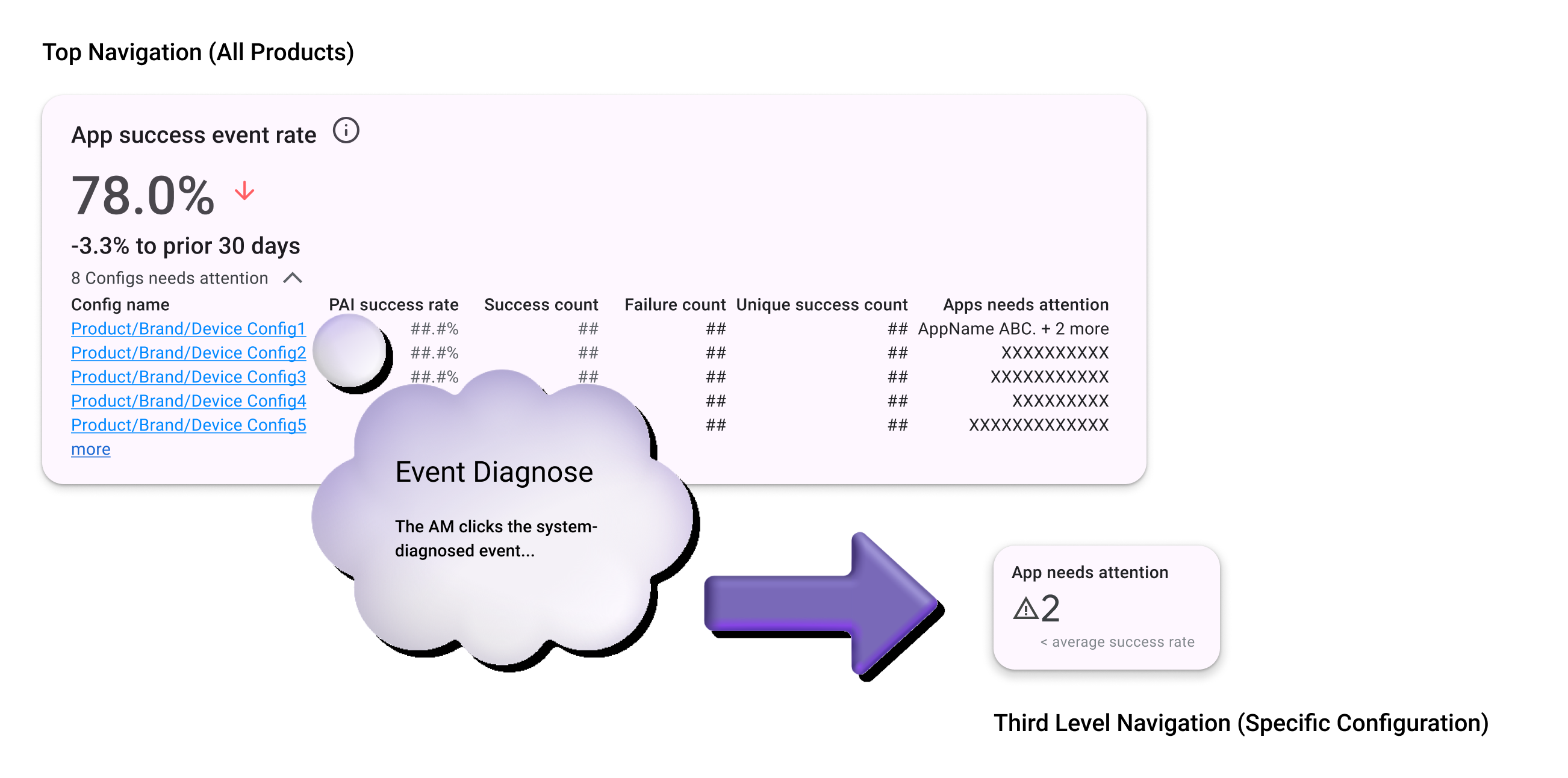
My V2 Strategy: I also designed and presented the 'Layered Investigation Flow'—a V2 vision to automate diagnosis by deep-linking from a metric directly to the action.
V2 Vision: 'Layered Investigation Flow'
My V1 MVP solved the biggest complaint ('data dump') by co-locating the Scorecard. But I knew a key piece of friction remained: the manual diagnosis. The AM could see what was wrong, but not why. They still had to manually hunt through configuration logs to find the cause.
My V2 vision was designed to automate this final, costly step. I designed an 'event-driven' flow that doesn't just show a metric; it shows the reason. This flow turns a 5-minute manual hunt into a 5-second action, truly closing the loop from insight-to-action.